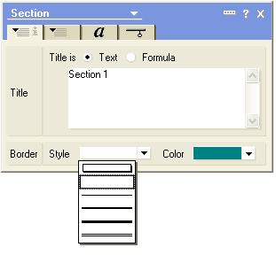
One thing I find really annoying in Notes is that when new interface options are added, particularly in rich text, they are often hidden. For example, if you create a collapsed section, you have various options about how it will display, and these have been enhanced through various Notes releases.
R5 Collapsible Section Border Styles
In R5, you could have no border, a box border, a single, double, triple or two-line border. In R5, the drop down box used for choosing these options was fairly clear.

ND6/6.5/7 Collapsible Section Border Styles
In ND6, this was enhanced, but how many options were added? If you were to look at the display, you would see just one new option, which is a "window caption" style. Unless you looked closely, you might not even notice that there is now a scroll bar, as it seems so pointless. The drop down box already hangs below the properties box, so there is no apparent reason why you would need to scroll down to see more information.
So, you could easily miss that there are three more options hidden below the one new one that is displayed. These are the gradient toolbar, which is a very nice effect that takes the border color and makes a solid bar gradient to white. If you can imagine it, look below this image where I have an example.
The question remains, why would IBM not make this more visible?
Small example of three new section options
I had to shrink these down due to my blog size constraints, but give them a try for yourself to see how to make cool new sections that will wow your boss and amaze your co-workers.
But this is not the only example, or even the worst. Look at the dropdown box for determining how to edit the rich text field from the web.
R5 Web Access options for Rich Text Field
In R5, there were only two options, and again, they were pretty easy to see.
But, as I have written about before, in Notes 6, a new option was added.
ND6/6.5/7 Web Access options for Rich Text Field
Look at these two carefully. Would anybody who wasn't actively looking for it know to scroll down? Would anybody who was looking for iteven know how to find the Using Best Fit for OS? And why would this dropdown box not just be extended one extra row? This has been around since ND6 was released and neither of these two examples has been altered at all through ND7, but it could be done in any point release. This is not the stuff you should have to wait for Hannover to fix. This should be in 7.0.2.
Oh well, off my soapbox.
Copyright © 2006 Genii Software Ltd.